Stealing frameworks from game design...
Hello there :)
Welcome to issue eighty one of Manufacturing Serendipity, a loosely connected, somewhat rambling collection of the unexpected things I’ve recently encountered.
This newsletter is free to receive, but expensive to make :)
If you’d like to support me, and can afford to do so, please consider buying me a coffee. Your support means the world to me, and keeps this newsletter free for everyone.
Speaking of coffee, grab yourself a suitable beverage my loves, let’s do this thing…
Part I: Things I’ve been thinking about
Proven / Improved / New
Last week, I read the latest issue of Nicole Zhu’s newsletter (it’s great - you should subscribe), where she shared a “rule of thirds” framework for game design — Proven / Improved / New:
“I started a new job last November and one of the teams I work on is responsible for prototyping new games (psst check out our latest beta game, Strands!). Game design is completely new to me. A few of my colleagues come from the gaming industry, so it’s been fun to learn about design principles, game mechanics, and testing. One thing my product manager shared with me is how she thinks about the ideal breakdown of a game, a different “rule of thirds”: ⅓ is proven, ⅓ is improved, and ⅓ is new.
In my cursory research, this is a concept from Mark Pincus, founder of Zynga, that was one of the guiding principles of the company. As Pincus taught his business school students, “To create hit games, you often must start with proven elements that are working in the industry. You then add features that are better, ideally substantially so, and then sprinkle in more new things to make the game feel fresh and innovative.”
“Proven” means that an element of the game is a known success, like the popularity of farm life sims, whether that’s Stardew Valley or Animal Crossing.
“Improved” means focusing on making an aspect better, for example, emoting in Fortnite includes popular dances and more pop culture relevance.
A “new” capability is something unique to your idea and therefore differentiates it, like all the macabre things you can do in the Sims and its made-up language, Simlish.
In her newsletter Zhu goes on to write about how the “Proven / Improved / New” framework might also be applied to various types of fiction writing. This got me thinking about other types of creative work where this framework might also be useful, and it occurred to me that it’s equally applicable for Digital PR ideation.
When it comes to generating ideas for Digital PR ideas, many people get overly hung up on originality, something which (potentially controversially) I don’t worry too much about. Trying to come up with an idea that’s 100% original is nigh on impossible; and this framework takes some of the pressure off.
Moreover, in my experience, “original” ideas often struggle to gain coverage. In our quest to create something original, we forget about the pool of journalists we were seeking to target, and, as a result, accidentally create something with limited appeal, and/or no clear news hook.
So, how might this work for Digital PR? I think it’s easiest to explain with an example.
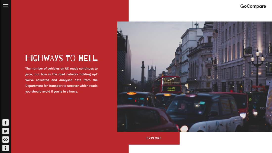
Back when I was at Verve Search, we created this piece for our client, GoCompare, where we revealed the most congested roads in the UK:
For clarity, this is not an original idea, but it was very successful, we generated over 300 pieces of linked coverage from this piece.
Here’s how it breaks down in terms of Proven / Improved / New:
Proven - from our research we found that traffic and congestion was a topic that motoring journalists (who we were seeking to target) wrote about with reasonable frequency — they’d previously covered various studies, using a range of data sources from different companies; i.e. this is topic with proven appeal.
Improved - rather than worrying too much about creating a totally original piece, we were instead thinking about how we might improve upon the studies which were already out there. We noticed that whilst a bunch of these studies already existed, they were often based on quite limited datasets, and/or offered only a surface level analysis. We felt that these were areas where we could legitimately improve upon with our own study.
New - there really wasn’t much that was truly “new” about this piece. We identified a handful of “new” data sources (but they were all publicly available); which we then combined, and analysed in greater depth. As a result we were able to provide journalists not just with stories about the most congested roads across the UK overall, but also with much more granular detail about the most congested roads in both regions and specific cities — effectively we were able to provide journalists with “new” stories, thanks to the improvements we’d made to previous studies.
But am I really applying a “rule of thirds” here?
Nope!
However, it occurs to me that for Digital PR, “Proven” is potentially the most important element – i.e. proven appeal (i.e. topics which journalists are already writing about with high frequency) is arguably a better predictor of success than “Improved”, or “New”.
That’s not say that seeking to include “Improved”, and “New” elements isn’t important, I think it is, I’d just weight things a little differently. Rather than aiming for 33% Proven / 33% Improved / 33% New; for Digital PR ideas I think I’d be looking to aim for something like 50% Proven / 30% Improved / 20% New.
Got thoughts on this? I’d love the hear them :)
Serendipitous finds:
Working With Your Hands Is Good for Your Brain
Activities like writing, gardening and knitting can improve your cognition and mood. Tapping, typing, and scrolling? Less so.
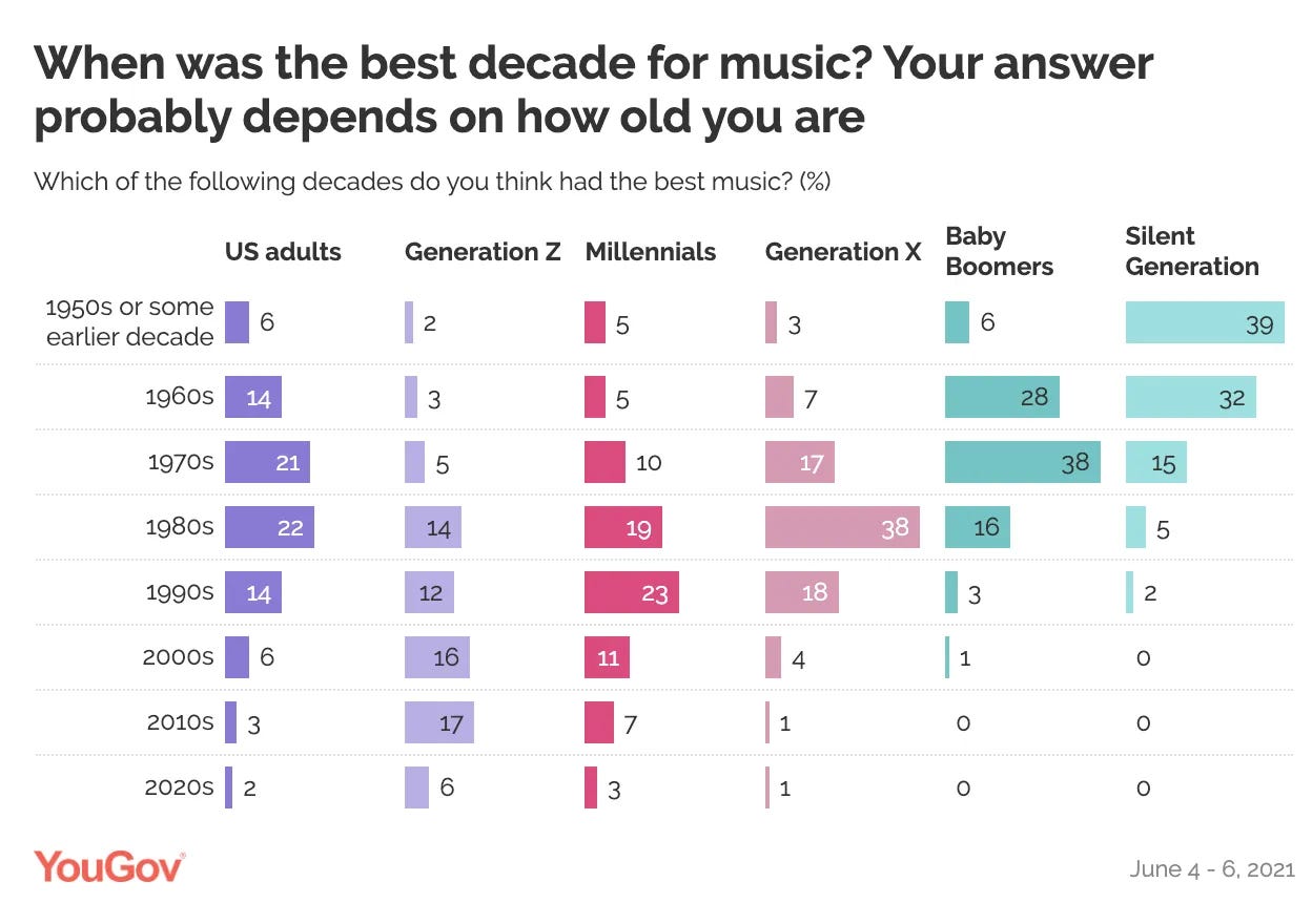
When Do We Stop Finding New Music? A Statistical Analysis…
An exploration into various studies which reveal that every generation believes music was "better back in my day."
Created by Lorenzo Bernini, and coded by Gianluca Ventani, the Fictional Brands Archive is a collection of many fictional brands found in films, TV series, and video games.
It’s really fun to browse, and I was particularly interested to learn more about both the fictional cigarette brand Morley which has been used in a range of shows and movies (but the show I most closely associate with the brand with is X Files), and, more broadly, why these fictional brands exist.
According to Bernini:
“One of the oldest recurring fictional brands is Morley cigarettes, created by Earl Hays Press for Alfred Hitchcock's film Psycho in 1960. The Morleys were not used in many productions during the 1970s and 1980s because large tobacco companies, such as Philip Morris, were among the main financiers of films and television series where the main characters smoked recognizable and popular brands. However, after a series of laws outlawed the possibility of advertising cigarette brands in movies and TV series, Morleys returned to frequent appearances. Morley cigarettes are the most widely used fictional brand in film history, and their popularity grew particularly following the X-Files series, where one of the main antagonists is an avid Morley cigarette smoker.
One reason why productions often use fictional brands is when the brand in question must necessarily be associated with a negative event or behavior, out of narrative necessity. One of the most famous fictional brands that originated from this reason is Oceanic Airlines, first seen in the Flipper series in 1965. This brand has become popular and has been used in numerous productions, including Lost, 24, and Fringe.”
How teens benefit from being able to read ‘disturbing’ books that some want to ban
Here, Gay Ivey, Professor of Literacy, University of North Carolina – Greensboro, shares learnings from a range of studies about the benefits of encouraging young people to read — they become more empathetic, their relationships improve, they become more thoughtful, they reported being happier, they became better readers, and some even reported that reading helped them deal with both depression and grief.
I found this article from Marc Watkins on the consequences of generative AI usage in an educational context really interesting:
“What generative AI gives to the user is a frictionless experience. Regardless of what you ask a chatbot, the response is always instantaneous, confident, and reasonable sounding. Users trade speed over accuracy and cede their critical thinking to a technology they likely don’t understand, just that it quickly gives them a response.
The current chatbot interfaces can be used to help students learn, that’s undeniable. We’ve seen hundreds of use cases for the tech in the classroom, but nearly all of them ask the user to pause and add friction to the overall experience. After all, learning is friction. Using AI in learning cannot be so lightning-quick that a user doesn’t bother to examine the output or take ownership of it. And this pedagogically puts education at odds with the current wave of frictionless chatbot interfaces dominating the market.
I fear education is setting itself up for defeat by embracing a strategy of introducing friction into a technology that does not allow for slowness, uncertainty, or critical examination. This battle must be waged outside of the classrooms in the critical design arena. We need to advocate for slowness, for moments of built-in inquiry so that users have to pause and examine an output generated by this technology. Only then can we unlock the transformative potential of this technology in education, fostering an environment where students and teachers alike can harness the power of AI while preserving the those skills of analysis, creativity, and intellectual curiosity that define the human experience.”
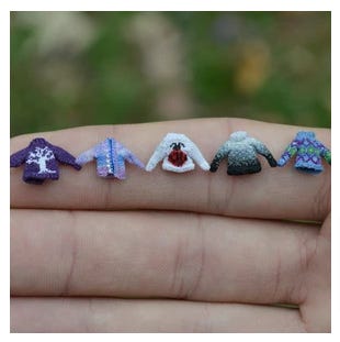
Althea Crome’s Micro Knits for Coraline
A delightful deep dive into the work which went into the making of Coraline’s starry sweater — click through to read the full article and watch the behind-the-scenes video from LAIKA.
You might also like to check out more of Crome’s work on her website:

Part II: Books I’m Reading Right Now
One for Sorrow (a book of old-fashioned lore), Chloe Rhodes — this is a fascinating collection of short essays where Rhodes uncovers the origins and meanings behind a range of traditional English sayings.
In the excerpt below she explains the origins of the proverb, “cut your coat according to your cloth” — which was apparently also a reminder to know your place when it was originally coined. (In England back in 1574 your social class determined not only the clothing you were likely to be able to afford, but there were actual laws governing both the cloth and the colours you were allowed to wear):
“Cut your coat according to your cloth…
This instructive saying has been used since the sixteenth century to encourage people to live within their means, and was already listed as a proverb in John Heywood’s 1546 collection of proverbs. It refers specifically to the cutting of fabric by tailors or housewives, and some interpretations of the phrase take it as a straightforward example of limiting yourself to what you have at your disposal.
Others cite another possible source: the strict laws that governed who wore what in Elizabethan England. In around 1574 Elizabeth I passed several ‘sumptuary’ laws (named after the Latin word for expenditure) called ‘statutes of apparel’, which dictated with astonishing detail the colours, cuts, and fabrics that could be worn by people of each social class. Laws preventing overspending on frivolities, food, and entertainment had been a feature in Roman courts and in Tudor times were justified as a means of preventing people from getting into debt, but the rules were as much about emphasising class divisions as they were about protecting the well-to-do from overspending.
They decreed that purple must only be worn by royalty and that silk be reserved for only those of knightly status or above, while lower-class-women must limit themselves to wool, linen, or sheepskin, in orange, beige, or yellow.
The cloth you cut your coat from might therefore have been determined not only by what you could afford, but by what your social status allowed you, so the phrase was a reminder to know your place as well as to spend only what you could afford. These days the snob factor is absent from the phrase’s meaning but we still use it to warn big spenders against overloading the credit card.”
Wild, huh?
Part III: Things I’ve Been Watching
Ugh. I keep falling asleep whenever I try to watch things. Expect some recommendations next time.
Part IV: What I’ve been up to…
I had a lovely weekend with my Dad, and we went out for a fancy dinner with our friends Dale and Wendy which was ace. BrightonSEO was fab, and I was spoiled rotten with lots of lovely birthday gifts.
What’s next?
I am excited about:
Heading to Confidence Live
Visiting Diana this weekend
Kicking off the latest cohort of my Ideation Course
A weekend away with Dad, Dale, and Wendy
Shameless self-promotion
Planning on heading to BrightonSEO in October this year? If so, you might like to sign up for my in-person Content Creation for Digital PR training course.
That’s all from me for now :)
If you enjoyed this newsletter, please consider sharing it, and if you would like to support me you can buy me a coffee.
Big love,
Hannah x
PS Wanna find out more about me and my work? Head over to Worderist.com


